Approach & Direction
In partnering with Design, we kicked a few ideas back and forth. My goal was to let Design be creative, think outside of the box and bounce ideas off of me to ensure they could be completed in the time and scope allotted for this project.
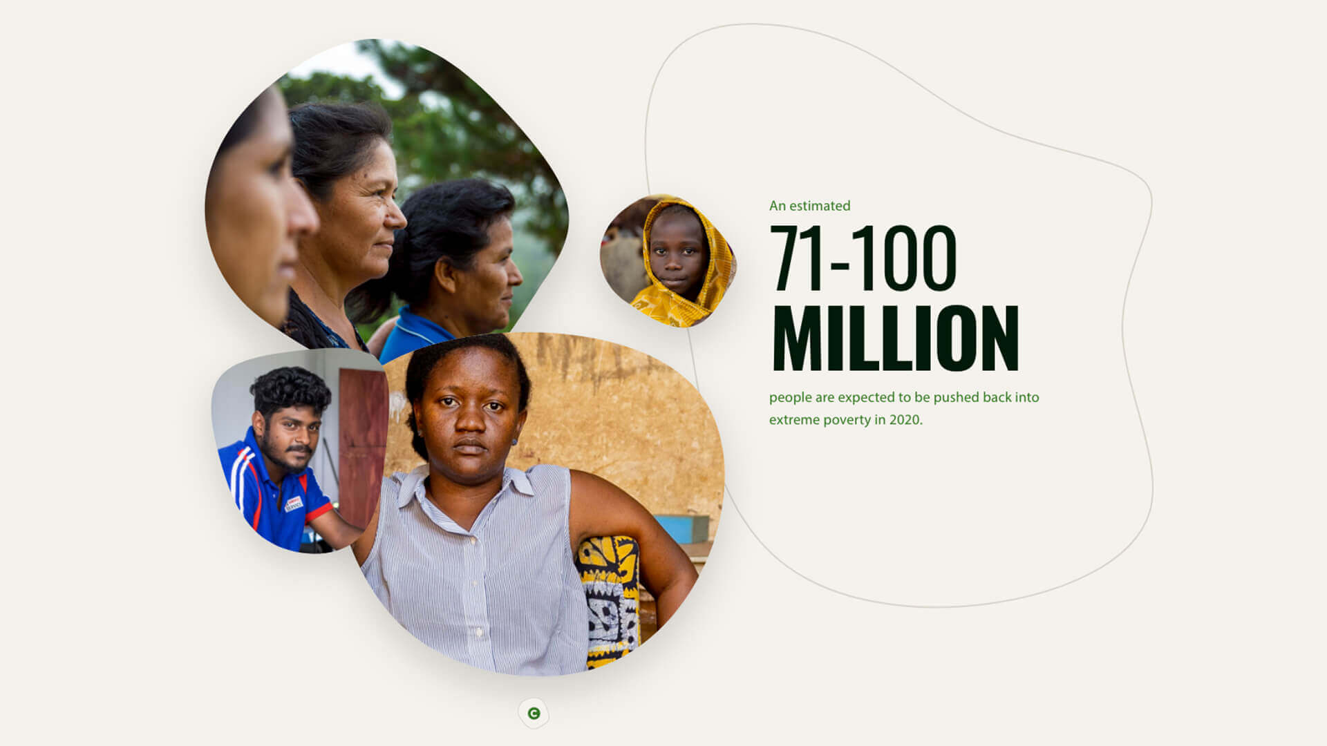
Design came up with the idea of organic shapes that animated like a microscopic cell. When looking at a cell there is always some movement on a microscopic level. Design wanted to take that idea and make text and image shapes that felt like looking under a microscope.
When Design bounced this idea off of me, I thought it was great and I got to work mocking up some prototypes. Here are some early codepen’s to ensure it was what design was looking for.
See the Pen Blob mask by Garrett (@garrettmasters) on CodePen.
See the Pen Animated Blob by Garrett (@garrettmasters) on CodePen.
Design Review
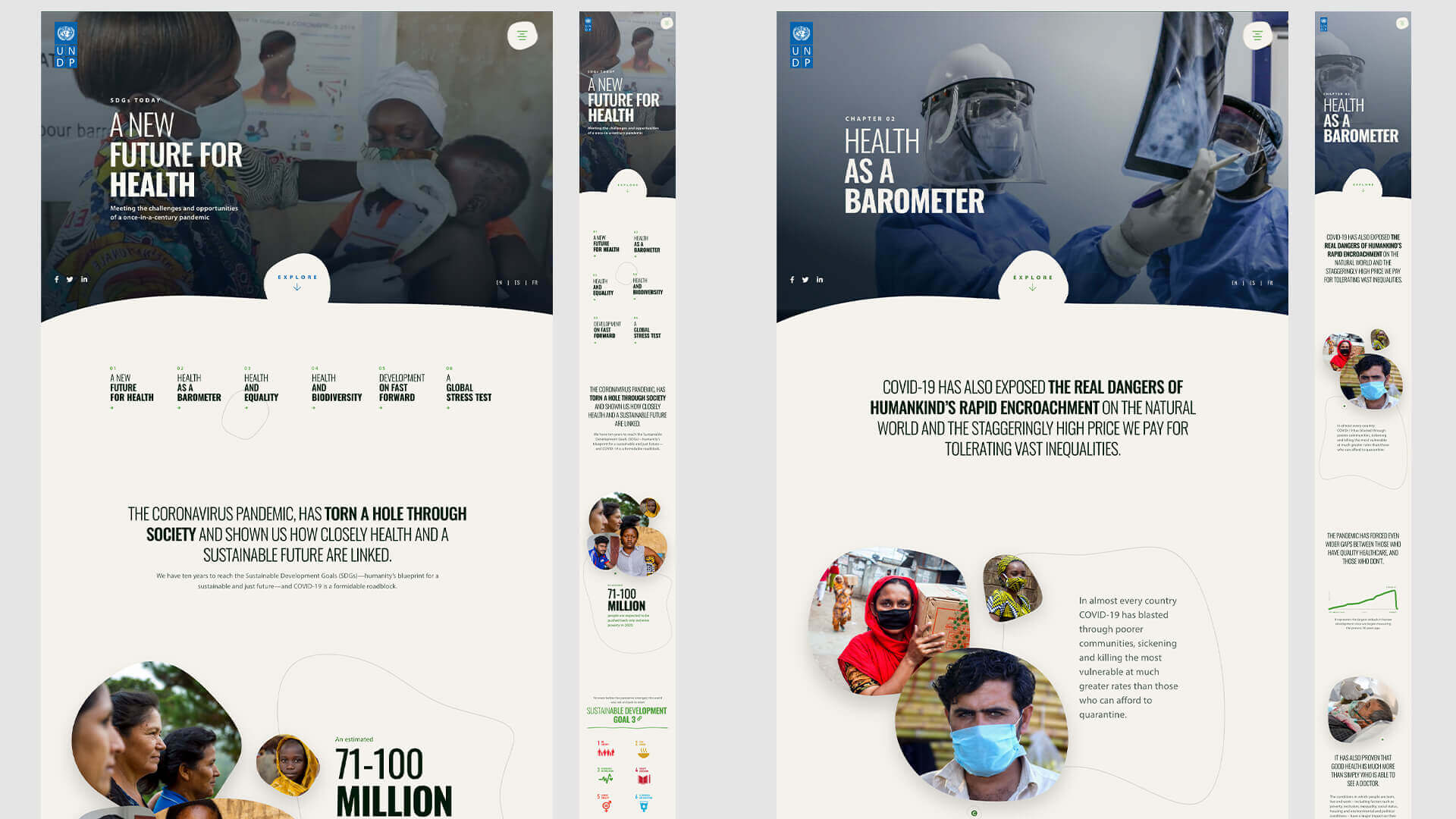
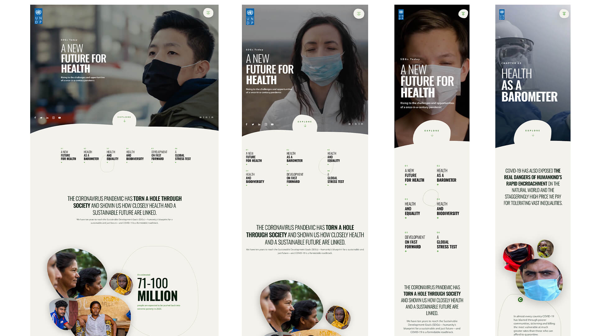
We landed on making a chapter approach that has six pages (or chapters) to tell this whole story. These chapters would be broken down as follows:
- A New Future for Health
- Health as a Barometer
- Health and Equality
- Health and Biodiversity
- Development on Fast Forward
- A Global Stress Test

Execution
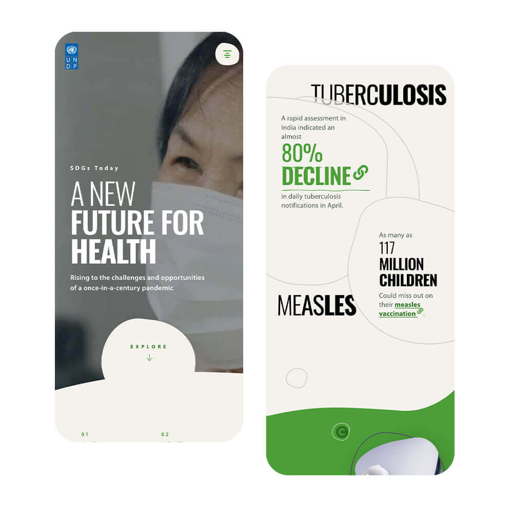
With the mobile-first approach, we wanted the website to be slim and not have to rely on heavy frameworks.
I built the site using webpack which translated my SCSS into CSS as well as minified the javascript for this website. This allowed us to streamline the code for production.
Challenges
The challenge was that the images that were organic shapes needed to have an overlay to display the image credit. In addition, the images also needed to incorperate a drop shadow.

Solution
The organic image shapes proved to be challenging for all the things that they needed to accomplish. From prototyping, we knew that we could animate svg shapes in after effects. However, we didn't have the time or budget for an animator to create all the shapes we needed. We saved a lot of time early on since the animating prototype that I brought to design accomplished what they were looking for.
This animation was simply using border radius to create the shapes. These border radiuses were percentage based like the following: (border-radius: 71% 42% 45% 69%/25% 43% 69% 89%;). I could animate the shape I created by using simple keyframe animations to finish the feel of an organic amoeba.
I created the shapes as a div element which had the img element inside. Taking advantage of a pseudo element, I could create an overlay. The copyright text was a hidden "p" tag that displayed based on a class. The end result allowed the user to click on the copywrite prompt which added the class, displaying the overlay and the text for each image.

Conclusion
I am glad that I was able to be a part of this project. Every time I am able to work closely with Design I learn something new. This definitely pushed what I thought could be possible with CSS. I am always anxious to learn more and push the boundaries.
